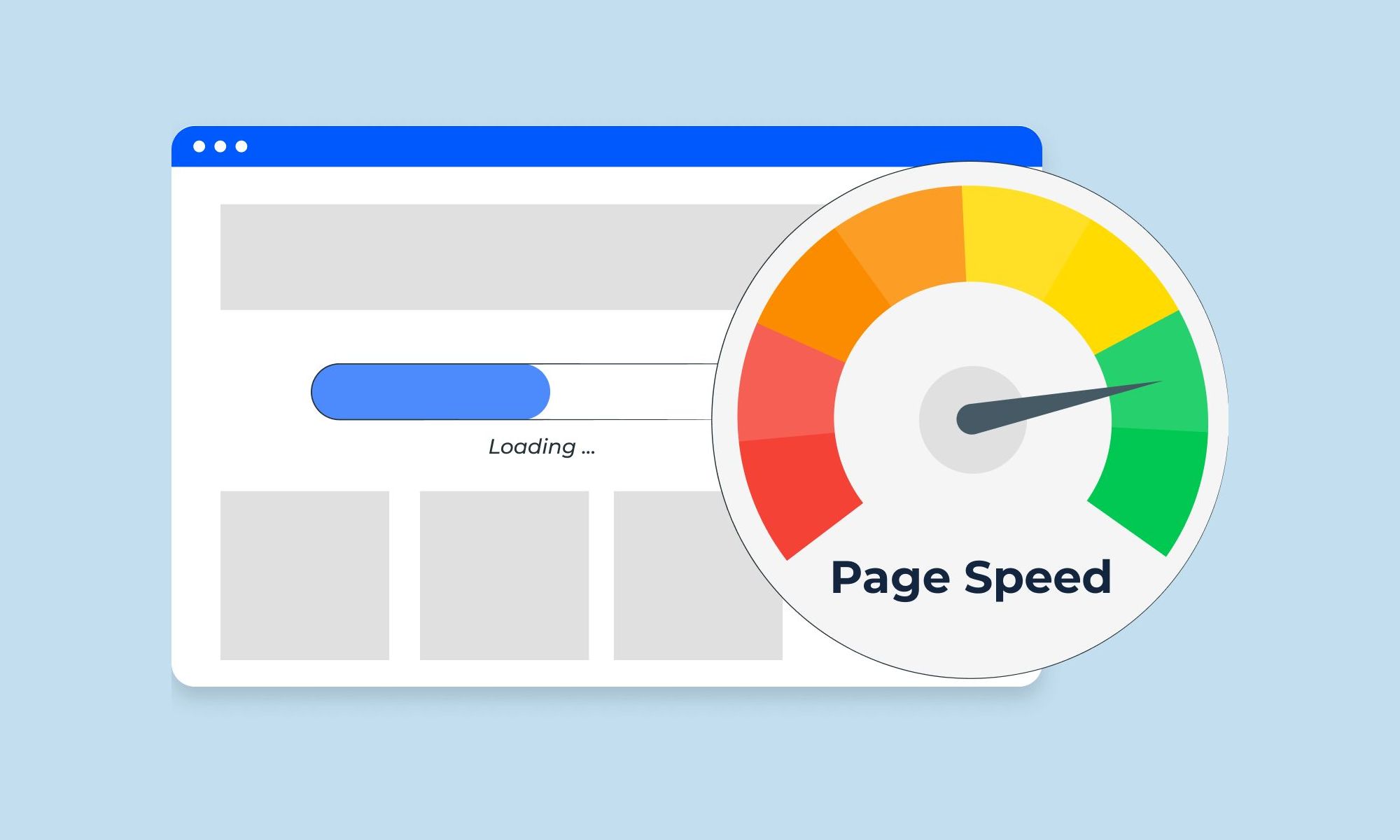
Step 1 - Optimize Images
Use Picture Element
When uploading images, the picture element helps adjust file sizes for different screen sizes. Example:
The picture element adjusts images for different screen sizes. This loads smaller images on small screens, with a fallback for older browsers.
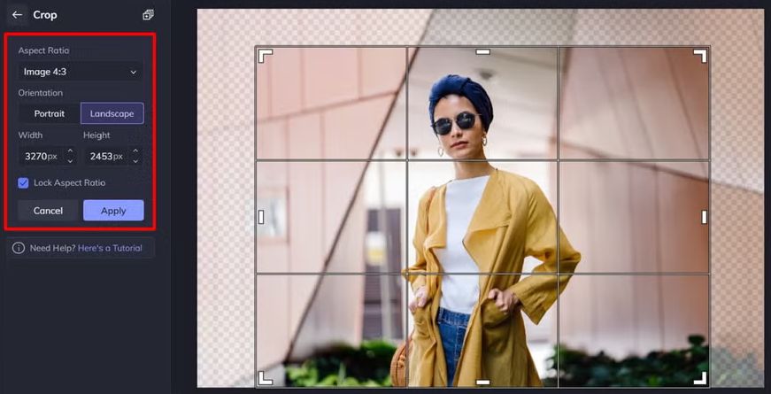
Crop Images to Display Size
Cropping images to display size is important for optimal presentation. If an image is 1200x300px on desktop, crop it to 600x150px for mobile screen.
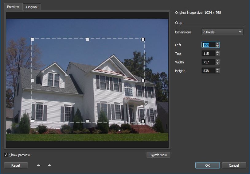
This ensures efficient loading, especially for mobile users with limited bandwidth compared to desktop.
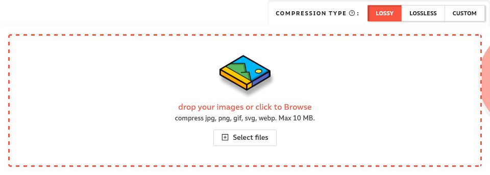
Compressing Images
After cropping, compress and convert images to WEBP for better performance. Use compressor.io for easy bulk compression. This step significantly reduces image sizes, optimizing load times for both desktop and mobile versions.
Lazy Loading
Use lazy loading to delay image loading below the fold, improving page load speed. Avoid applying it to above-the-fold images to prevent Content Layout Shift (CLS) and maintain performance.
Image Decoding
Add decoding="async" to image tags to defer image decoding and speed up content display. This improves performance and load times.
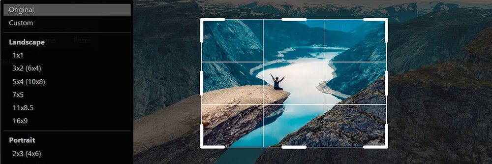
Optimize Landing Page Image
To speed up mobile loading, I crop the desktop image to focus on the center, instead of loading the full image.
Preloading Critical Images
Use the preload tag to load images and fonts, before HTML parsing starts.
This improves page load speed for content above the fold.
Lazy Load Background Images
To achieve a perfect score, use the picture element for lazy loading background images. Place it at the bottom of the main container, like this:
Improve your #cta section by using a captivating background image. Set the container to position: relative and z-index: 1. Use the picture element for flexible image handling, allowing lazy loading and decoding. Serve different images for mobile and desktop:
Set the picture element to 100% height and width of the #cta container, positioned absolutely with a negative z-index to stay behind content. Uses object-fit: cover to fill the container proportionally, mimicking background-image in CSS.

Using an HTML overlay to darken images improves visuals. HTML background images enable lazy loading and easy image swapping. This improves page speed and load times
Step 2 – Optimize Google fonts
For optimal font performance, avoid Google Fonts CDN. Use Google Webfonts Helper to subset fonts, keeping only essential characters. This reduces bloat and improves page speed.
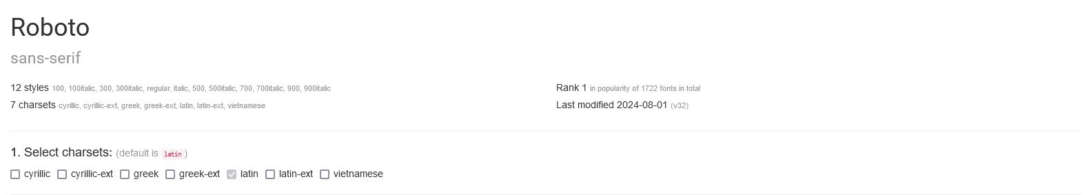
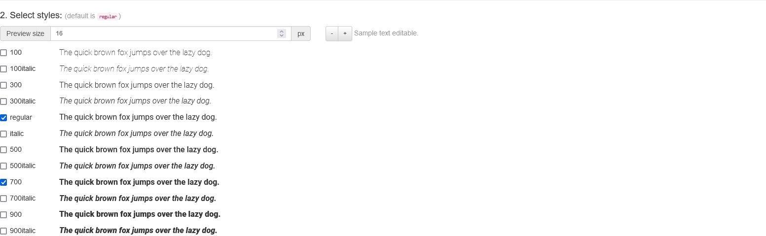
For optimal performance, select only essential font weights and styles. Avoid unnecessary styles to keep load times fast.
After selecting your fonts, click "Modern Browsers" for the CSS code. Customize the file paths at the bottom to match your folder structure.
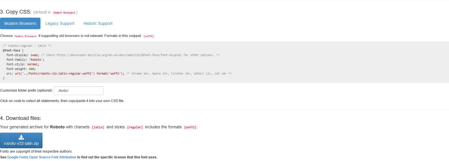
Add font-display: swap; to your root.css file:
Download and place your fonts in the /fonts folder.
Preloading Your Fonts
To preload fonts for faster loading, add this code to your preload section, adjusting the href with your font file path:
Preload only the primary font style used above the fold to boost site speed. For multiple styles, use separate preload links for each font file. This can improve your page speed score.
Fixing Flash of Unstyled Text
To avoid layout shifts from default to custom fonts, set a similar fallback font. Use font style matcher to align the fallback with your primary font in size and shape. Ensure both fonts have the same size and line height.
Render Blocking Scripts
Google Analytics
To improve page loading, place the Google Analytics script before the closing body tag. This avoids render-blocking and ensures content loads first.
Minify CSS and JS
To minify CSS, use npm i sass with the --style=compressed option. This reduces file sizes.
Use SVG’s Wherever You Can
I prefer SVGs for elements like icons and contact details, using image tags to keep the DOM clean and manageable. SVGs are scalable and adaptable, making them ideal for various uses.
Defer nonessential Javascript
Place non-essential JavaScript files at the bottom of the page with the defer attribute. This avoids blocking rendering and ensures smooth page load. Example:
Remove jQuery and Other Third Party Scripts
To improve performance and security, consider removing jQuery and replacing with native JavaScript. This can improve page speed and security. Replacing Font Awesome icons with SVG icons can reduce load times.
Prevent CSS stylesheet from render blocking
A large CSS file can slow page rendering and affect your Page Speed score. To improve performance, defer non-critical CSS by isolating essential styles in a "critical.css" file and using a script to load the main CSS after the page has loaded.
If JavaScript is disabled, CSS might not load. Use noscript tag to ensure the CSS loads:
This code loads a stylesheet if JavaScript is disabled. Here is how it looks:
To optimize page speed, load your critical CSS first and defer the remaining styles. Use noscript tag for users with JavaScript disabled. This can help achieve a perfect page speed score and resolve render-blocking issues.
