How Do Colors Affect Mood and Emotions?

Color is far more than just a visual experience. It shapes our perceptions, influences our emotions, and drives our decisions—often without us even realizing it. In fact, studies suggest that up to 90% of snap judgments about products or people are influenced by color alone.
Understanding color psychology helps us choose the right colors for our wardrobe, branding or environment—creating the mood, energy or impact we want to project.
What is Color Psychology?
Color psychology is a branch of color theory that studies how colors influence human behavior, mood, and emotion. Certain colors evoke almost universal responses due to how they stimulate the brain, while others carry cultural-specific meanings. For instance, white may symbolize purity in Western cultures but mourning in parts of Asia.
Your personal color preferences are often rooted in childhood experiences and emotional memories. If you wore yellow on a bad day, you might grow up disliking it. But if you always wore blue during happy occasions, you'll likely favor it later in life.
How Colors Influence Emotions
Color influences emotions through visual stimulation, symbolism and association. Each color on the spectrum carries its own emotional energy, often based on:
- Temperature (warm vs. cool)
- Brightness (light vs. dark)
- Saturation (muted vs. vivid)
Let’s explore the psychological effects of six major colors and how they can be used to influence mood.
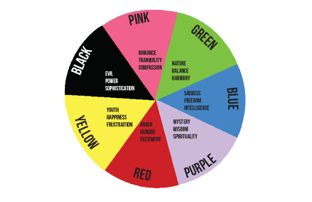
🔴 Red: Passion, Energy & Power
Red is a commanding color that draws the eye. It’s intense, emotional, and bold—linked to love, desire, anger and danger.
- Psychological Traits: Stimulating, passionate, aggressive, energizing
- Physical Effects: Increases heart rate, respiration, blood pressure
- Common Associations: Strength, urgency, masculinity, appetite stimulation
When to Use Red:
- To boost confidence or exude authority—a red scarf or tie is a classic power move.
- In marketing, red grabs attention (think clearance sales or fast food).
- Wear red sparingly in business—too much can be overwhelming or intimidating.
🔍 Fun Fact: Politicians often wear red ties to signal confidence and control, especially when paired with blue to balance power with trust.
🟠 Orange: Optimism, Enthusiasm & Creativity
Orange combines the warmth of red with the cheerfulness of yellow, creating a color that radiates friendliness and encouragement.
- Psychological Traits: Upbeat, energetic, extroverted, adventurous
- Common Associations: Creativity, success, affordability, vitality
When to Use Orange:
- Great for networking events—it sparks conversation and signals approachability.
- In business, orange can make a brand feel affordable and youthful (like Fanta or Nickelodeon).
- Choose orange in smaller doses—bold orange blazers, scarves or ties.
⚠️ Be cautious: Orange fabric can look cheap in the wrong lighting. Always check quality and tone in natural light.
🟡 Yellow: Intellect, Creativity & Happiness
Yellow is the color of the mind. It stimulates logic, curiosity and optimism, making it the ideal hue for creative environments.
- Psychological Traits: Uplifting, innovative, cheerful
- Physical Effects: Stimulates the nervous system, improves focus and memory
- Common Associations: Caution, brightness, innovation, playfulness
When to Use Yellow:
- In brainstorming spaces or to spark creativity—Post-it Notes are yellow for a reason.
- Pair with deeper tones (like navy or forest green) to balance brightness.
- Avoid overuse, especially in high-stress environments—it can cause agitation or anxiety.
🚫 Style Tip: Many men perceive yellow as unsophisticated, so be strategic if wearing it for influence.
🟢 Green: Harmony, Wealth & Renewal
Green is the color of balance and nature. It’s calming, refreshing, and deeply connected to growth and stability.
- Psychological Traits: Secure, calming, balanced, prosperous
- Physical Effects: Soothing to the eyes, promotes restfulness and renewal
- Common Associations: Health, money, sustainability
When to Use Green:
- Ideal for financial services, healthcare, or eco-conscious brands.
- Use darker greens for professionalism and wealth; lighter greens for freshness and vitality.
- Teal and aqua shades work beautifully for both men and women in professional wardrobes.
🌿 Green is especially effective when asking for funding or negotiating, as it conveys trust and self-assurance.
🔵 Blue: Trust, Peace & Professionalism
Blue is the most universally loved color—and for good reason. It represents stability, loyalty and calmness. It also lowers pulse rates, reduces stress and promotes clear thought.
- Psychological Traits: Trustworthy, dependable, peaceful
- Common Associations: Corporate culture, authority, loyalty, wisdom
When to Use Blue:
- Perfect for job interviews, client meetings and financial industries.
- Light blues suggest peace and openness; darker blues convey expertise and confidence.
- Blue is safe and conservative—but that can also be a downside if you want to stand out.
💡 Mix it up: Combine navy with a patterned or bright tie to add some flair without losing credibility.
🟣 Purple: Creativity, Luxury & Spirituality
Purple has long been associated with royalty, intuition and creativity. It stimulates the imagination and invites introspection.
- Psychological Traits: Artistic, spiritual, introspective, compassionate
- Common Associations: Quality, mystery, luxury, sophistication
When to Use Purple:
- Fantastic for creative professionals, premium products or service branding.
- Deep purples (like plum or eggplant) feel elegant and luxurious.
- Pastel purples can feel soft and romantic, great for artistic or wellness spaces.
🧠 Purple appeals to idealistic, emotionally intelligent audiences. Use it when offering bespoke services or when positioning as a premium option.
Final Thoughts
Color psychology isn’t a rigid formula. Personal preferences, cultural backgrounds, and even lighting conditions all influence how we perceive and react to color. But by learning the core emotional responses, you can use color as a tool to connect more meaningfully, whether you're dressing for a meeting, designing a website, or setting the mood in a room.
Want to project energy and confidence? Go red. Need to calm nerves or earn trust? Choose blue. Feeling adventurous or artistic? Purple might just be your secret weapon.