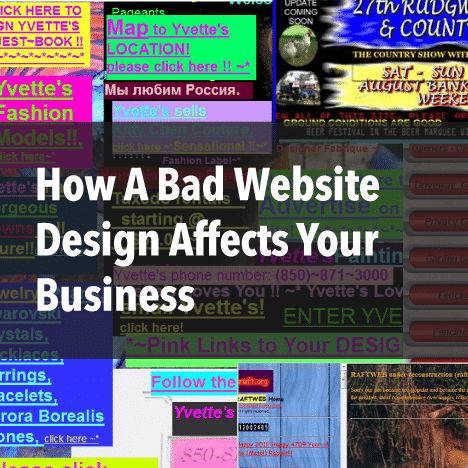
Bad Website Design to Avoid When Designing Your Website
A poorly designed website can drive users away, reduce conversions and harm your business credibility. To ensure your website provides an optimal user experience, avoid these common design mistakes and follow best practices for improvement.
1. Difficult Navigation
Navigation is one of the most critical elements of web design. If users cannot find what they need quickly, they will leave. Poor navigation manifests in several ways:
- A cluttered menu with too many options
- Hidden or non-standard navigation (e.g., unconventional icons or placement)
- Broken links or missing pages
How to Fix It:
- Outline Your Navigation Hierarchy: Plan a logical flow for your website’s pages, prioritizing essential ones.
- Ensure Homepage Access: Make sure your logo links back to the homepage and that navigation remains accessible on all pages.
- Test and Refine Links: Regularly check for broken links and remove any unnecessary ones to improve user experience.
2. Poor Color Choices
A chaotic color scheme confuses users and diminishes brand consistency. Too many colors or poor contrast makes content harder to read and navigate.
How to Fix It:
- Limit Your Palette: Stick to 3-4 colors—one primary color, two accents and a readable text color.
- Align Colors With Your Brand: Use colors that reflect your business personality and evoke the right emotions.
- Use Color Psychology: Different colors trigger different emotional responses. For instance, blue conveys trust, while red can indicate urgency.
3. Lack of Responsive Design
With over half of all internet traffic coming from mobile devices, failing to optimize for mobile users means losing potential visitors and customers.
How to Fix It:
- Use Responsive Web Design: Ensure your website adjusts automatically to different screen sizes.
- Test Mobile Usability: Use Google’s Mobile-Friendly Test to check your site’s responsiveness.
- Optimize Images & Buttons: Make buttons large enough for easy tapping and resize images to fit mobile screens without distortion.
4. Slow Load Time
A slow-loading website frustrates users and impacts your search engine rankings. Sites that take longer than 3 seconds to load tend to experience high bounce rates.
How to Fix It:
- Use Speed Testing Tools: Analyze your site with tools like Google PageSpeed Insights.
- Compress Large Files: Optimize images, videos, and scripts to reduce load time.
- Enable Browser Caching: Store elements locally on users' devices to speed up returning visits.
5. Too Many Elements (Cluttered Layout)
An overcrowded website makes it difficult for users to focus on important information and navigate smoothly.
How to Fix It:
- Declutter Your Design: Remove unnecessary graphics, animations and text.
- Use White Space Effectively: Allow breathing room between elements for better readability.
- Organize Content Logically: Group related content together and create a visually appealing hierarchy.
6. Weak Call-to-Action (CTA) Buttons
CTAs guide users toward desired actions (e.g., signing up, making a purchase). Poorly designed CTAs reduce conversions.
How to Fix It:
- Make CTAs Stand Out: Use bold, contrasting colors that differentiate CTAs from other elements.
- Use Action-Oriented Text: Instead of generic text like "Click Here," use compelling phrases like "Get Your Free Quote Now!"
- Position CTAs Strategically: Place them above the fold and after key sections to maximize visibility.
7. Difficult-to-Read Fonts
Typography plays a crucial role in user experience. Hard-to-read fonts decrease engagement and accessibility.
How to Fix It:
- Use Readable Font Sizes: Ensure body text is at least 16px for comfortable reading.
- Stick to 1-2 Font Styles: Too many fonts create visual clutter. Choose a clean, professional combination.
- Ensure High Contrast: Dark text on a light background enhances readability and accessibility.
8. Walls of Text (Lack of Content Formatting)
Blocks of unformatted text are intimidating and deter users from reading important information.
How to Fix It:
- Break Up Content: Use headings, subheadings, bullet points and numbered lists.
- Incorporate Visuals: Use images, videos, and infographics to complement text and enhance engagement.
- Keep Paragraphs Short: Stick to 2-4 sentences per paragraph to improve readability.
9. Incomplete Website Design
An unfinished or inconsistent website damages credibility and discourages users from engaging.
How to Fix It:
- Ensure Design Consistency: Use a uniform color scheme, font styles and layout across all pages.
- Double-Check Links: Remove broken links and ensure all pages are accessible.
- Use Placeholder-Free Content: Never leave unfinished sections like "Coming Soon" without a defined timeline.
10. Unsecure Website
Users are cautious about sharing information on unsecured websites. A lack of security can result in lost visitors and potential legal issues.
How to Fix It:
- Install an SSL Certificate: Websites with HTTPS encryption improve security and SEO rankings.
- Use Secure Hosting: Choose a reputable hosting provider with built-in security features.
- Implement Strong Security Measures: Protect user data with secure login credentials, firewalls and malware scanning.
11. Outdated Web Design & Content
An old-fashioned website signals neglect and diminishes trust. Users expect modern, functional and regularly updated sites.
How to Fix It:
- Update Design Trends: Keep up with modern design practices like minimalist layouts, bold typography and micro-interactions.
- Refresh Content Regularly: Review and update blogs, service pages and images to keep them relevant.
- Optimize for New Technologies: Ensure compatibility with voice search, AI chatbots and interactive elements.
Conclusion
Avoiding these common web design mistakes will help your website attract and retain users, improve conversions and strengthen your brand presence. A well-designed website should be visually appealing, easy to navigate, mobile-friendly and regularly updated with fresh content.

